Webkinz Website Redesign Exploration
Role
My role within this exploratory project was to design and build cohesive elements in Figma that are intuitive for users to use and navigate.
Problem
The Ganz eStore website accompanies the virtual game for users to purchase in-game currency and new pets and items. The website's current unorganized state can be difficult to navigate for new and current users. This is demonstrated through its multiple home screens where it is unclear which area you are currently in, the conflicting relationship between UI elements and typography, and inconsistencies in presenting information.
Audience
The main users of this website are consumers of the Webkinz brand. The brand began in 2005 and originally targeted themselves towards children ages 6-13. Now Webkinz has found most of its users in their early to late twenties due to nostalgia. This accompanying website is used by paying adults.
Strategy
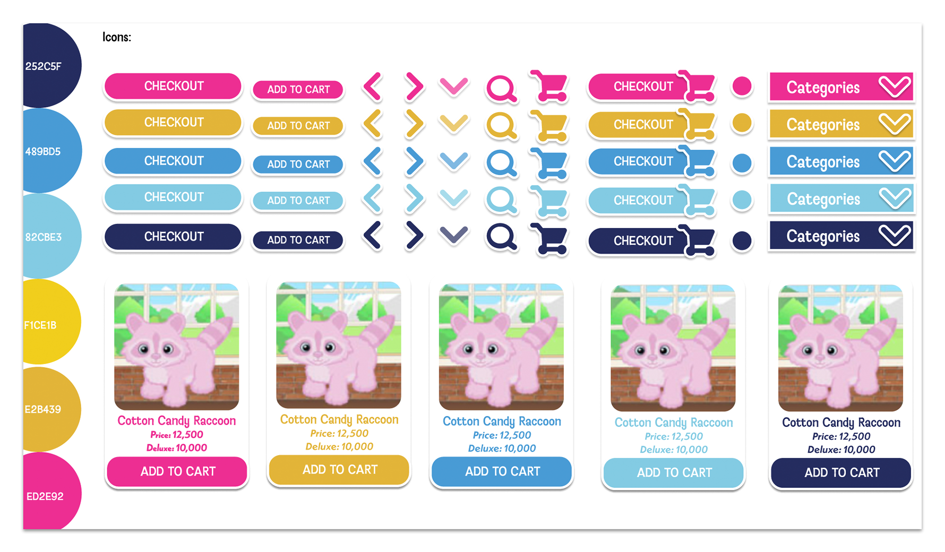
My main goal was to make the navigational aspects more intuitive through consistent visual and typographic identity that reflected the values and feel of the Webkinz brand. To do this, I researched Webkinz as a brand and navigated their website and game to understand how Webkinz feels as a user. I gathered images, colors, and typography to create a style guide where I experimented with various combinations to test legibility.
Final Product
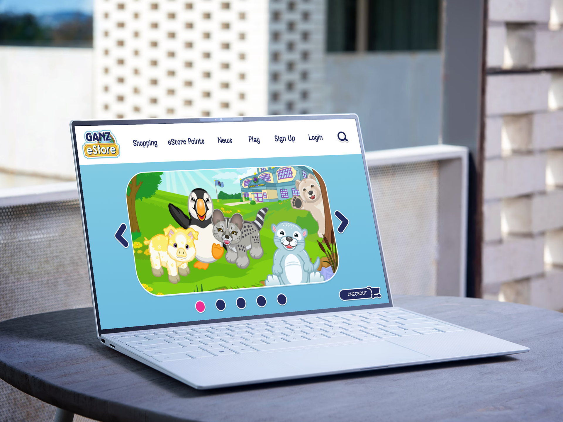
On the landing page, I designed a more simplified top navigation making it easier for the consumer to navigate. I mainly redesigned using blues, pinks, and yellows as well as white bordered rounded shapes which I feel are strong for legibility and neatness while remaining true to the friendliness of the Webkinz brand.
On the shopping page, I redesigned the side bar navigation to be simpler and less repetitive. To aid with that, I added a filters button to help focus your search for interesting items. I kept the pet grid system used in their current website but reduced the amount of pets per line to 3 and gave them more space.
The eStore Points page which now has the same type of layout as the shopping page. Since many of these purchases come with free items, I included a more button for consumers to not only pick what items they want, but be able to read and see it clearly.